
A Luxury Fine Jewelry House
Brand Strategy • Visual Identity • Packaging • Digital Presence
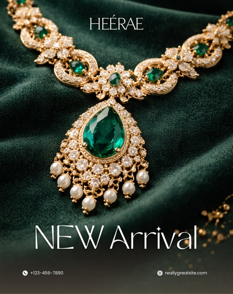
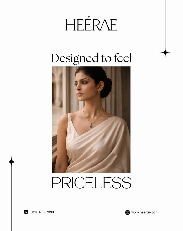
THE VISION
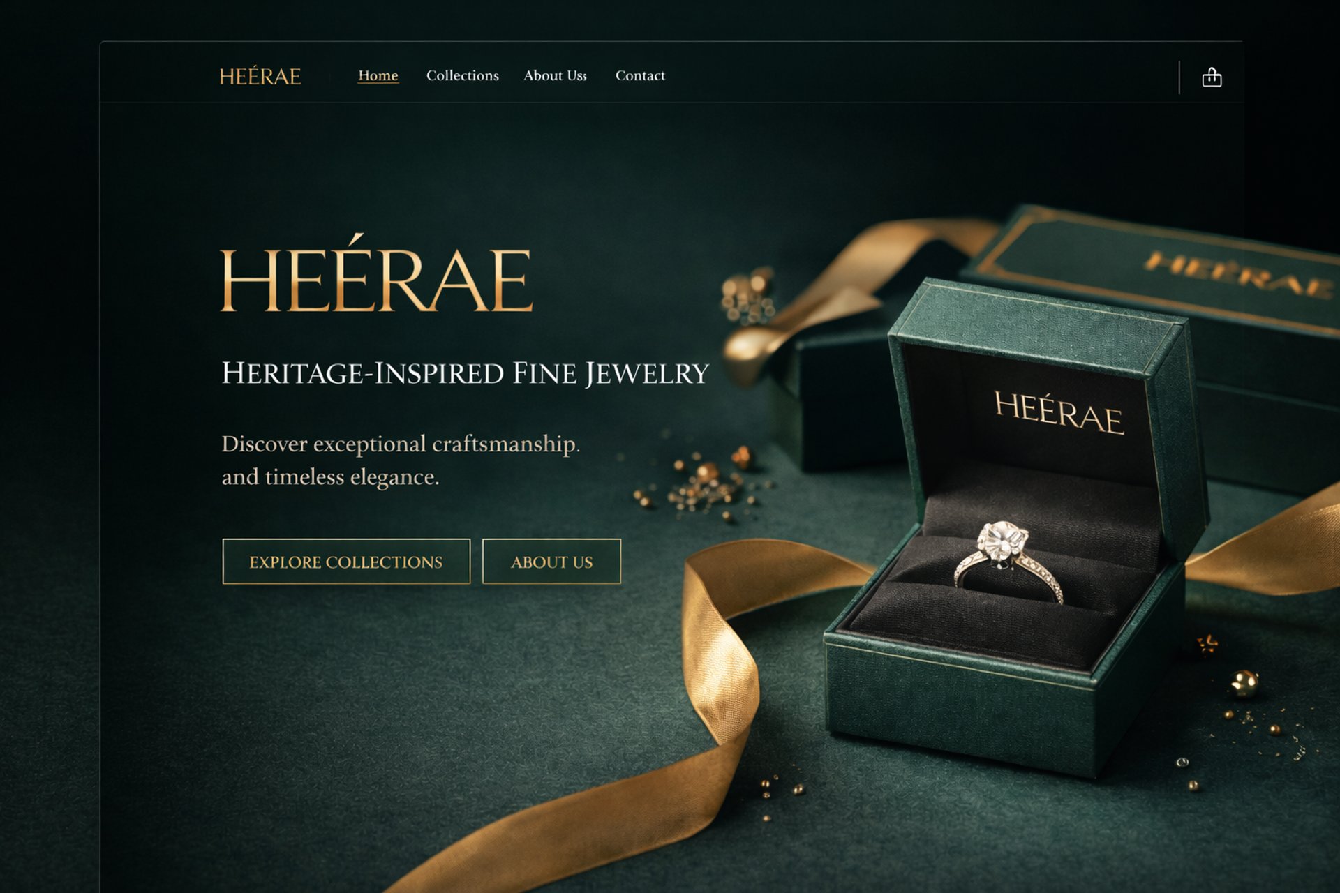
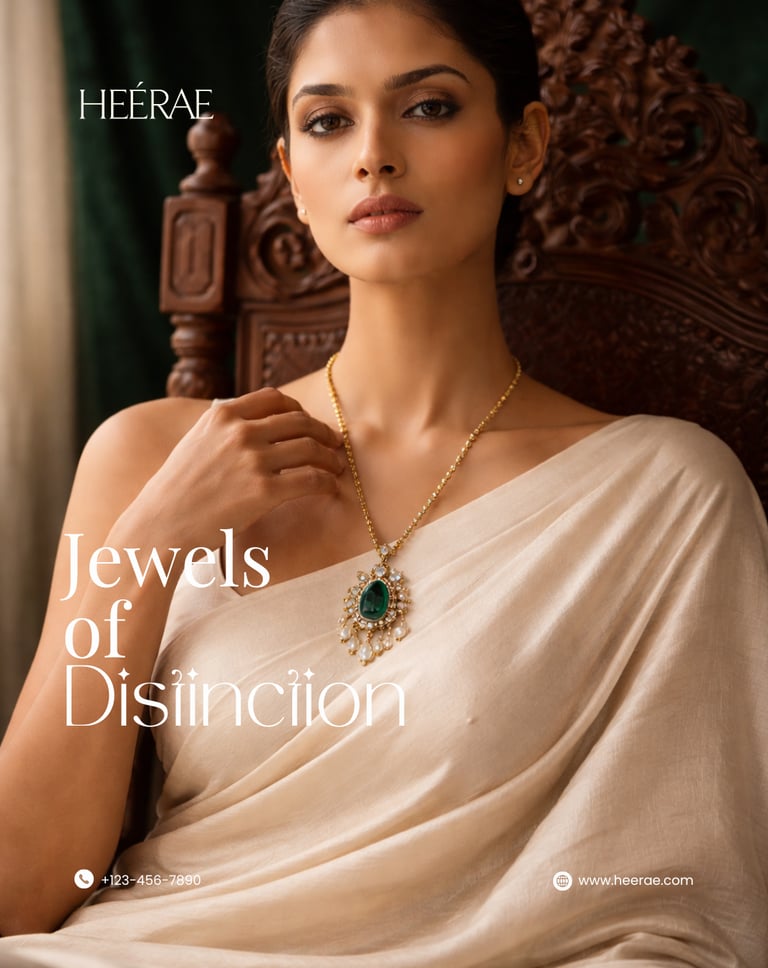
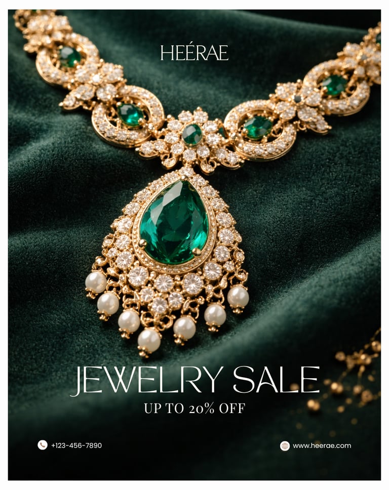
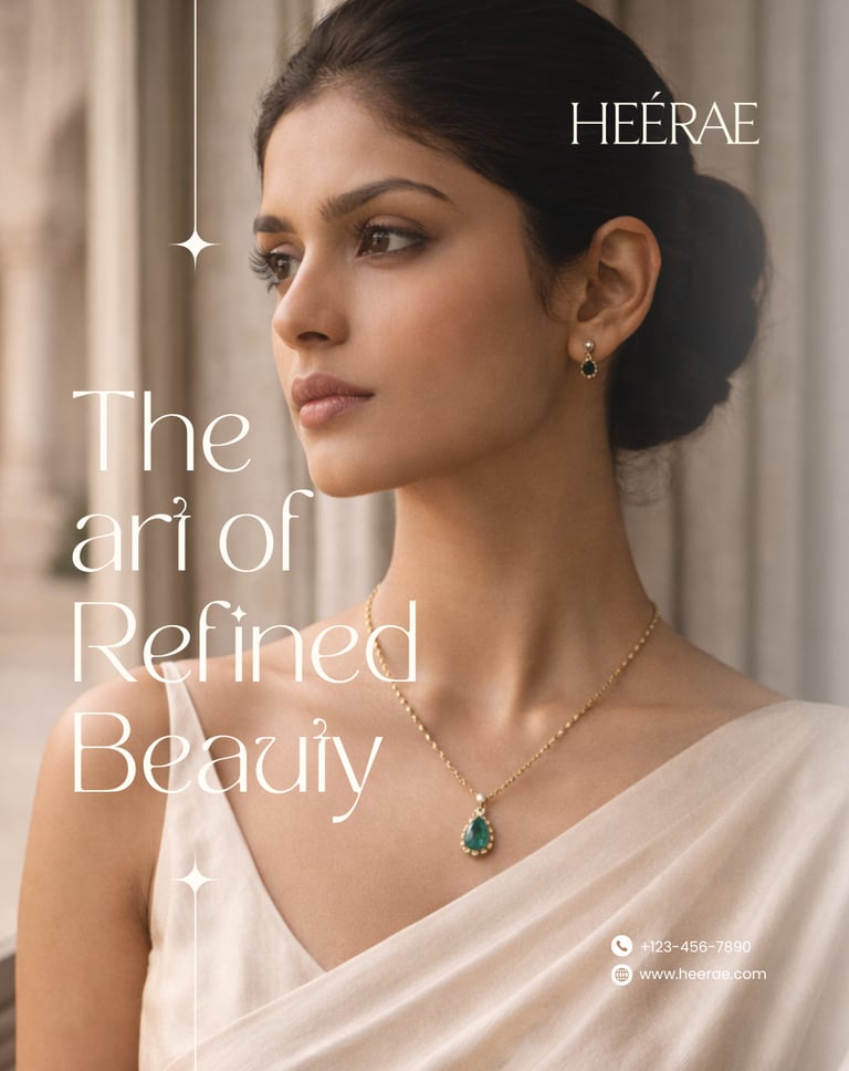
HEÉRAE was conceived as a fine jewelry house that blends Royal Heritage Craftsmanship with Modern Luxury Minimalism — designed for affluent wedding families, elite gift buyers, and premium retail clients.
To build a brand that looks expensive, feels timeless, and commands trust instantly.
THE CHALLENGE
The jewelry market is flooded with brands that look similar, feel loud, and lack emotional presence.
HEÉRAE needed to:
• Look instantly premium
• Feel royal yet modern
• Build trust without being flashy
• Compete visually with legacy jewelry houses
• Create high recall in a crowded luxury market
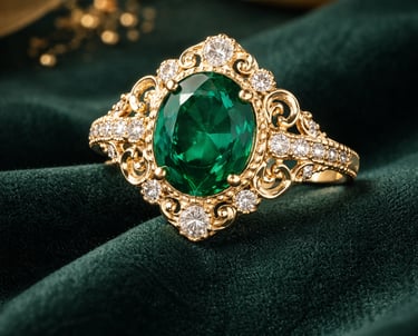
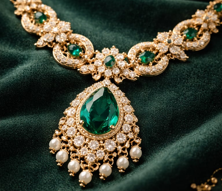
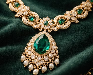
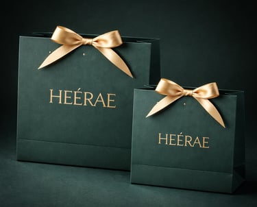
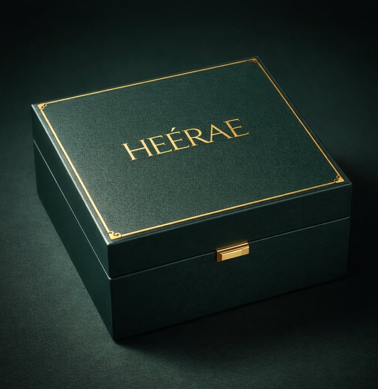
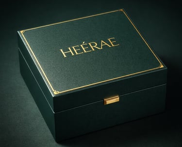
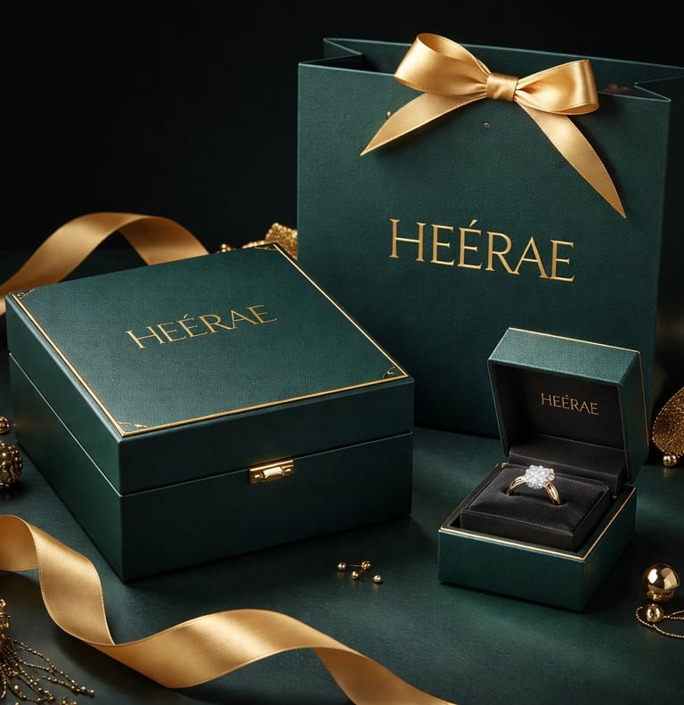
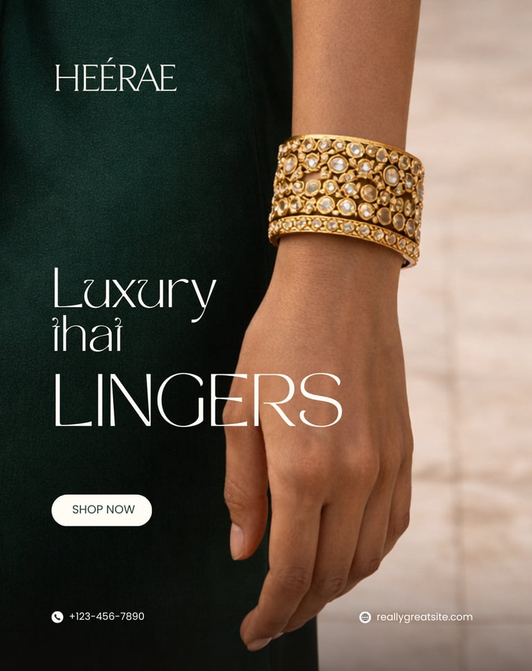
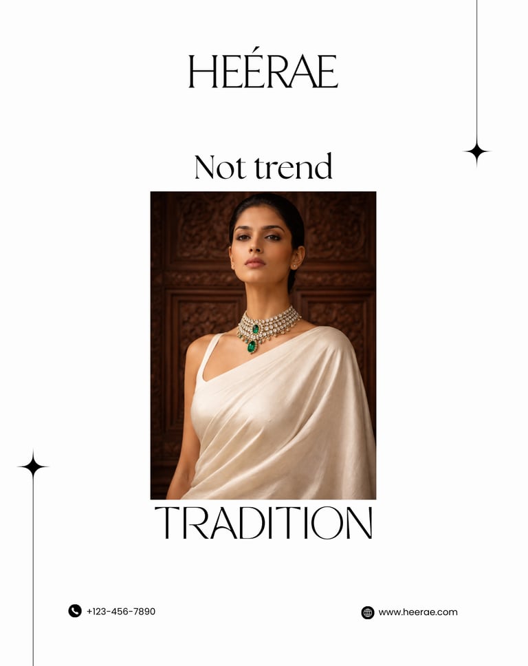
HEÉRAE COLOR LANGUAGE
A carefully curated palette combining heritage royalty, calm minimalism, and modern authority — designed to create trust, aspiration and premium recall.
DEEP EMERALD GREEN
Authority • Trust • Heritage • Calm Power
IVORY SILK
Soft Luxury • Purity • Calm Elegance
HERITAGE GOLD
Wealth • Royalty • Prestige
ONYX BLACK
Power • Mystery • Authority
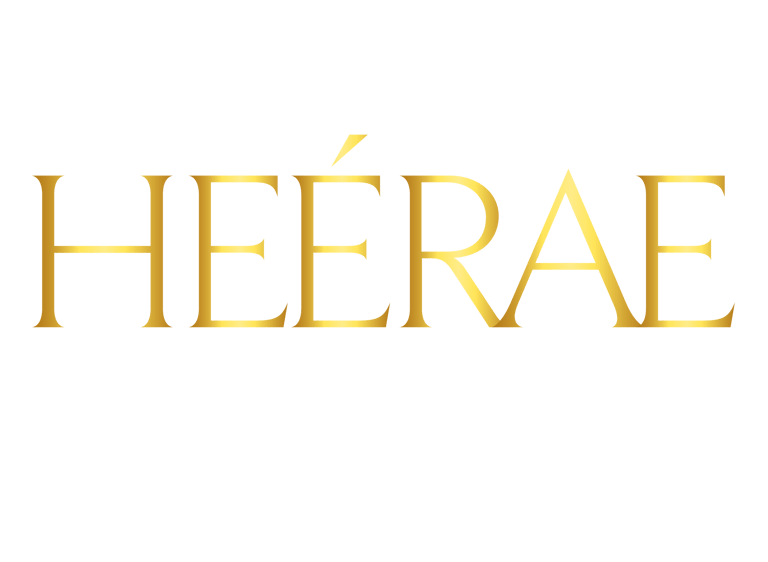
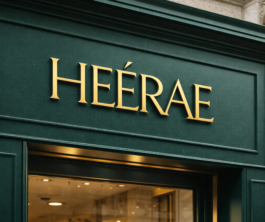
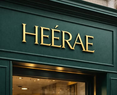
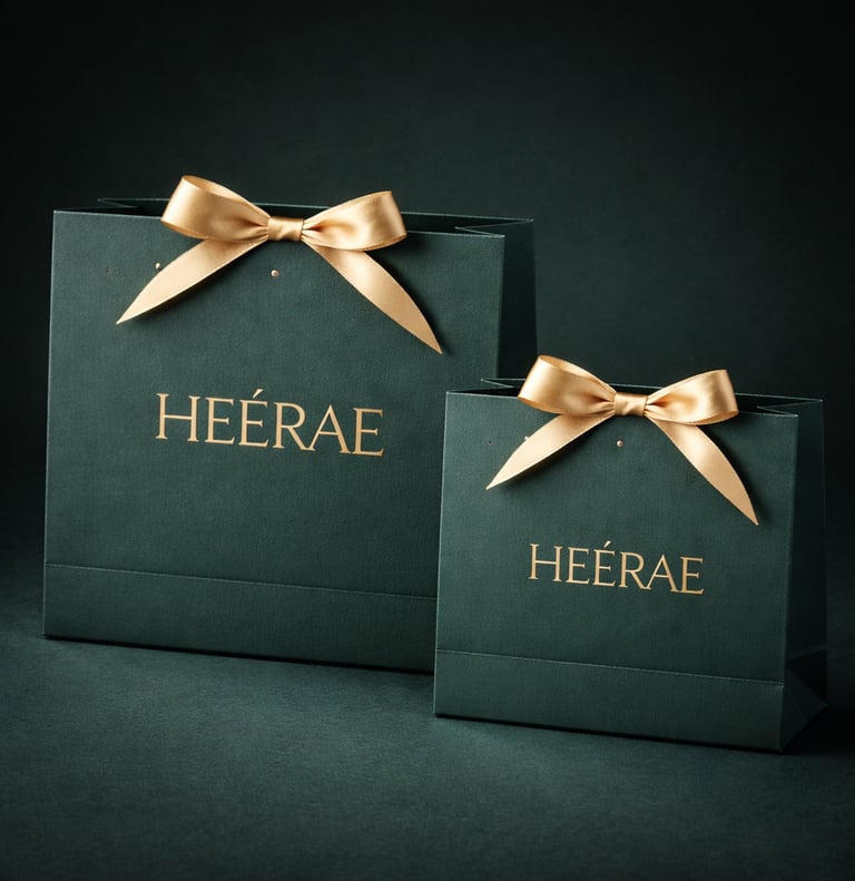
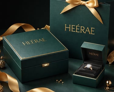
Primary brand mark used across packaging, storefront signage, and official brand communications
Primary Logo
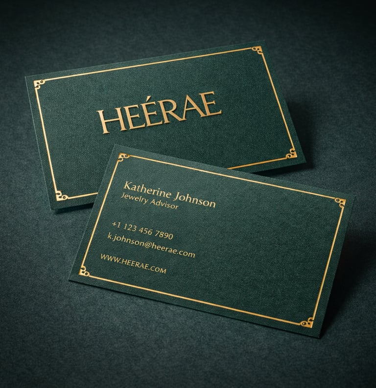
LOGO SYSTEM
Each logo version is part of a controlled identity system designed to maintain exclusivity and brand integrity.
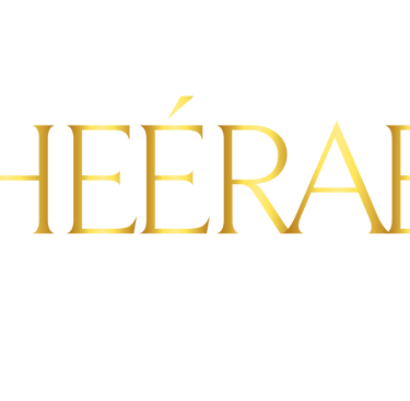
Secondary Logo
Minimal signature used for social media, print advertisements, and brand collateral.
Tertiary Logo
Refined identity version for ceremonial, feminine, and lifestyle-led brand expressions.


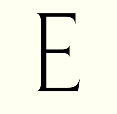

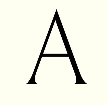


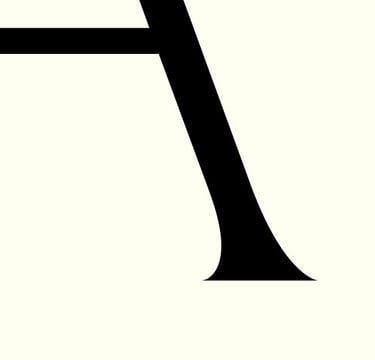
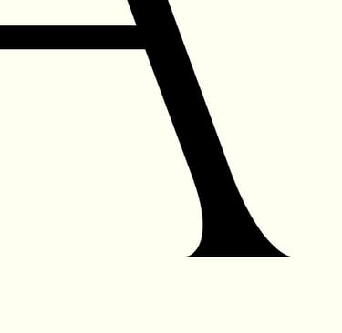
TYPOGRAPHY
Regal • Timeless • Heritage Luxury
Royal Serif – Beaufort Pro
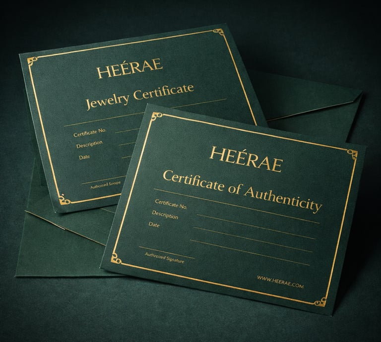
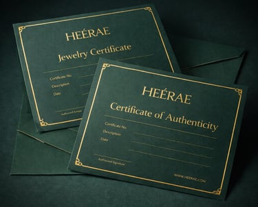
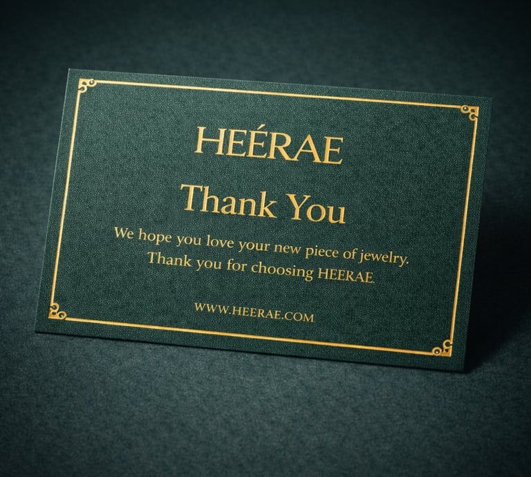
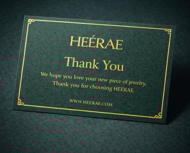
BRAND SYSTEM
A full Luxury Ecosystem

INSTAGRAM POST GRID
A full Spectrum Digital Studio
© 2025 MSHN Studio. All Rights Reserved
7877867053 | mshn.studio@gmail.com
CONTACT US